
What to wear
How to choose the best colors for your maternity photoshoot
There is no color that only suits one kind of woman. What a color does in a photograph depends on the lighting, the background, your makeup and the mood we are building — change any of those and the same fabric behaves differently.
So rather than assigning colors to people, it is more useful to know what each one does in the studio.
White and cream
Soft and airy. These are the lightest colors in the studio and they open a photograph up rather than closing it down. They suit gentle lighting, tender expressions and galleries meant to feel warm.
Black
Classic or dramatic, depending entirely on the light. Lit evenly it reads as elegant and timeless; lit from one side it becomes sculptural and strong. Black is the most versatile color in the room and the safest single choice.
Red
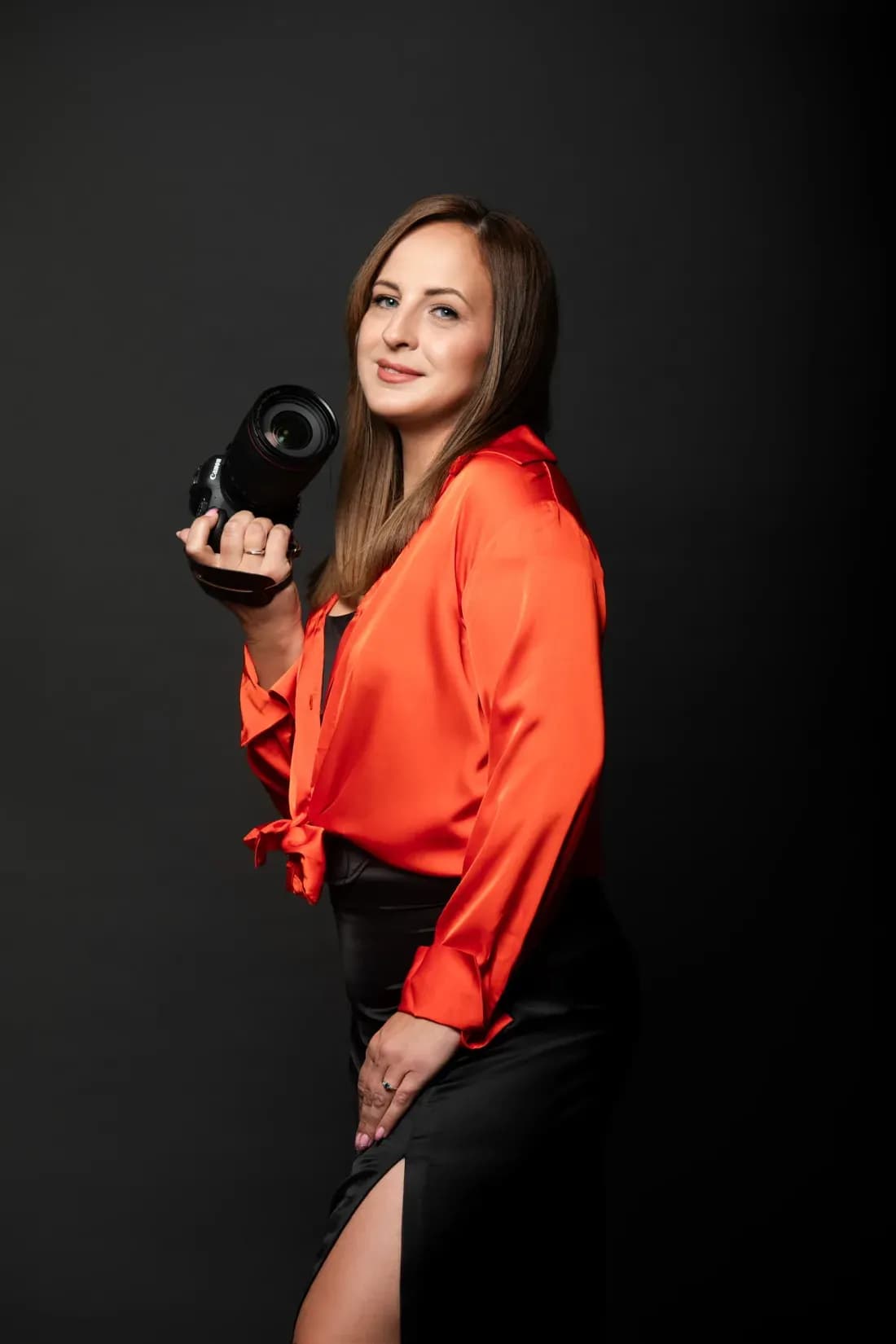
A statement, and it should be treated as one. Red dominates whatever it is placed beside, so it works best as one look in a gallery rather than the direction for all of it.
Gold
Luxury and artwork-inspired styling. Gold catches light in a way no other color does and photographs closer to metal than to fabric. It suits editorial direction and portraits intended to be printed large.
Earthy neutrals
Calm and timeless. Beige, tan, brown and muted greens sit quietly behind the face instead of competing with it, and they age better than any trend color.
Jewel tones
Emerald, sapphire, deep plum. Richer than neutrals and more controlled than red, they give an editorial look without taking the whole gallery with them.
Bare skin with neutral fabric
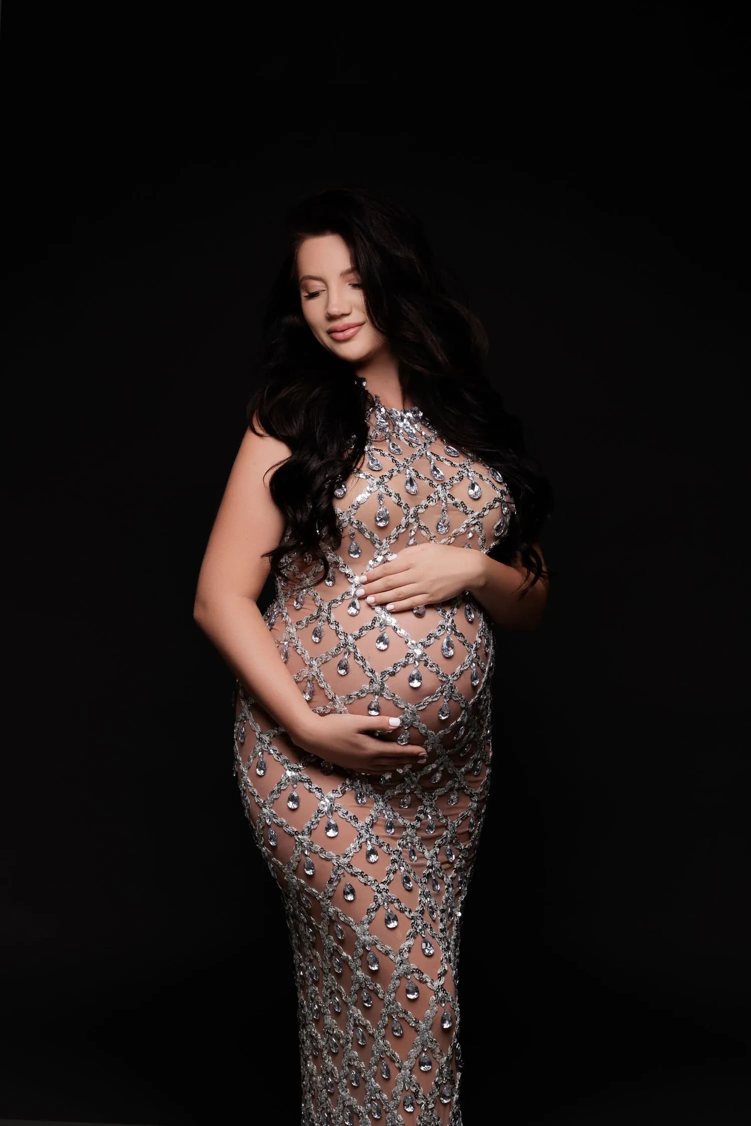
The most minimal option, and closest to fine art. With almost no color in the frame, the photograph is made entirely of light and shape.
How to choose
Start from the mood rather than the swatch. Decide whether you want the gallery to feel soft, timeless, strong or bold, and the color follows from that. Then bring one or two things you already love the look of yourself in — that instinct is usually right, and we can test it against the light before we commit.
Colors are also chosen against each other. A gallery in which every look is a different strong color rarely hangs together; one or two statements among quieter looks almost always does.
Frequently asked questions
Not on its own. Lighting, background, makeup and the mood of the session all affect how a color reads, which is why we test fabric against the light rather than deciding in advance.
Black. It suits both even and dramatic lighting, photographs well against most backgrounds, and does not date.
Yes. Bring it. Testing it under studio light takes a minute and you will see the answer for yourself.
No, but it should belong together. One or two statement colors among quieter looks reads as one gallery; five statements read as five separate sessions.
The wardrobe holds gowns, fabrics, bodysuits, accessories and statement pieces, and we choose from it together during your session.